I'm Anne-Sophie
a dataviz practitioner
By day, I am a senior data analyst at LinkedIn.
By evening, I keep using data visualisation to overanalyse things I like.
This website is a collection of personal and professional projects.
By day, I am a senior data analyst at LinkedIn.
By evening, I keep using data visualisation to overanalyse things I like.
This website is a collection of personal and professional projects.

I believe you can use this medium to:
A thorough investigator, I keep pushing for the 'so what?'.
I can deep dive into quantitative, qualitative, large or unstructured datasets.
Since 2024, I am working with D3, Svelte, and Layercake.
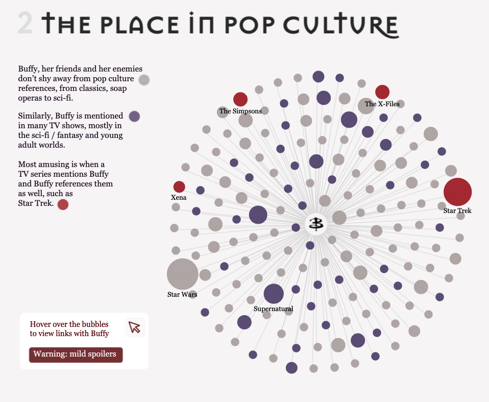
Prior to that, in 2021, I qualified for the Top 10 of Tableau's annual competition
Ironviz. Four of my vizzes also appeared as a 'Viz of the Day' on Tableau's
Public Gallery.
I'm used to webscraping techniques to extract data (via Webscraper.io,
Google Sheets or Beautiful Soup) and use advanced SQL for my main job.
I have created this website with HTML, CSS, Javascript and Svelte Kit.

Tableau 'Viz of the Day' (2023)

Top 10 Tableau Ironviz (2021)
Long listed in the IIAB (2022)

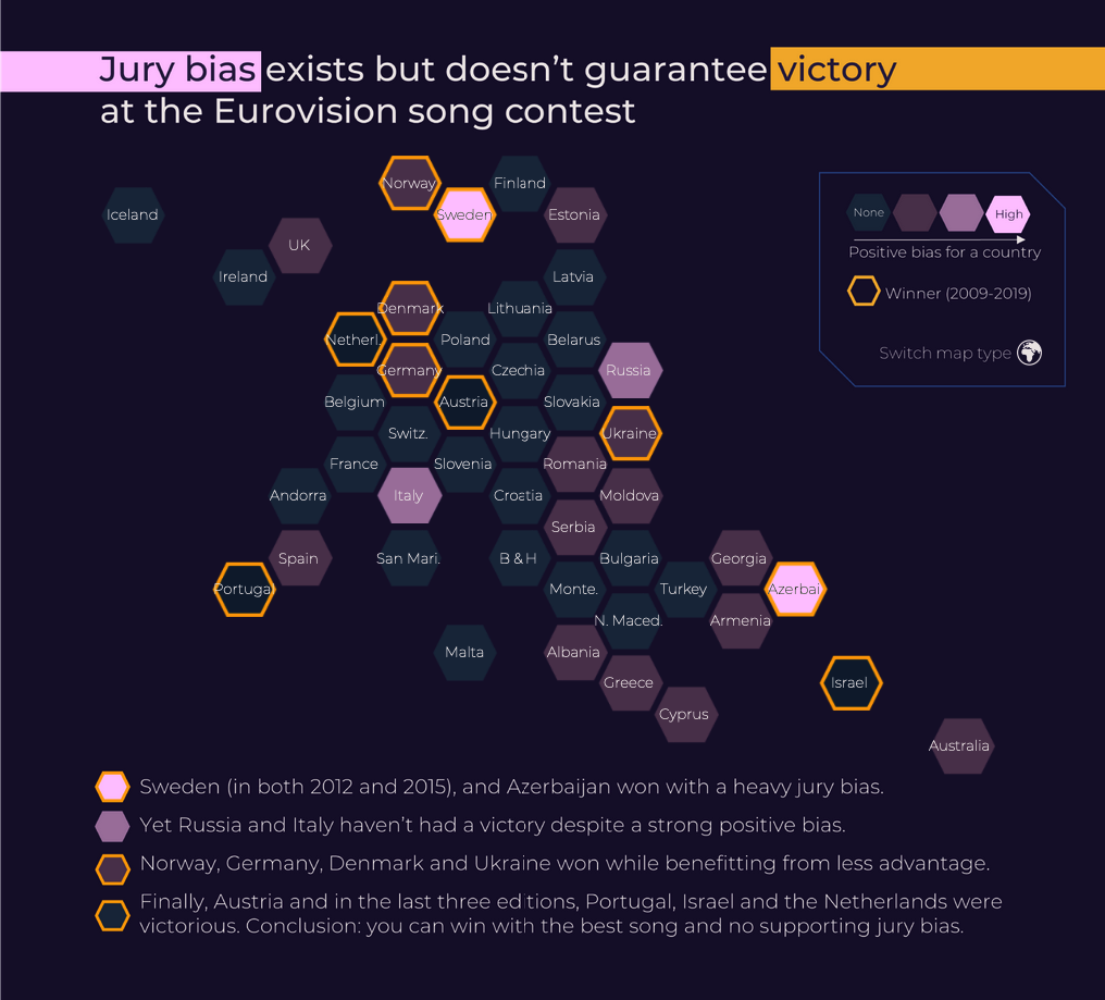
Tableau 'Viz of the Day' (2021)
Long listed in the IIAB (2022)
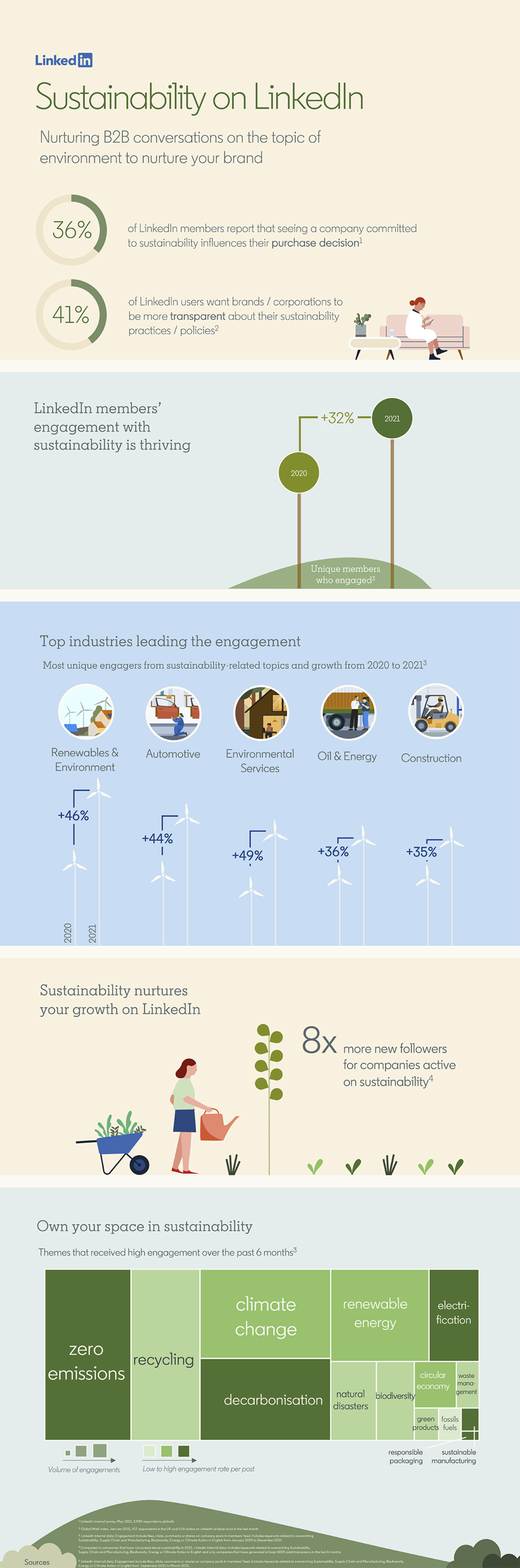
Posted on the LinkedIn Marketing blog
More projects on my Tableau profile